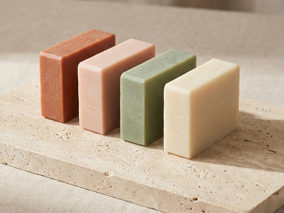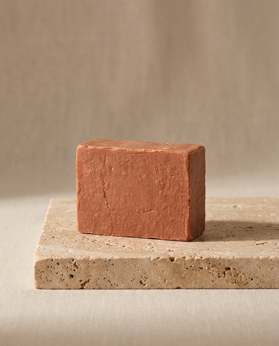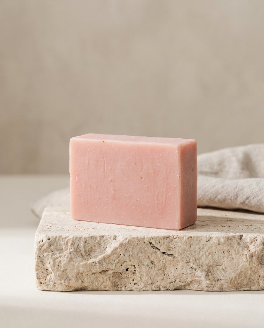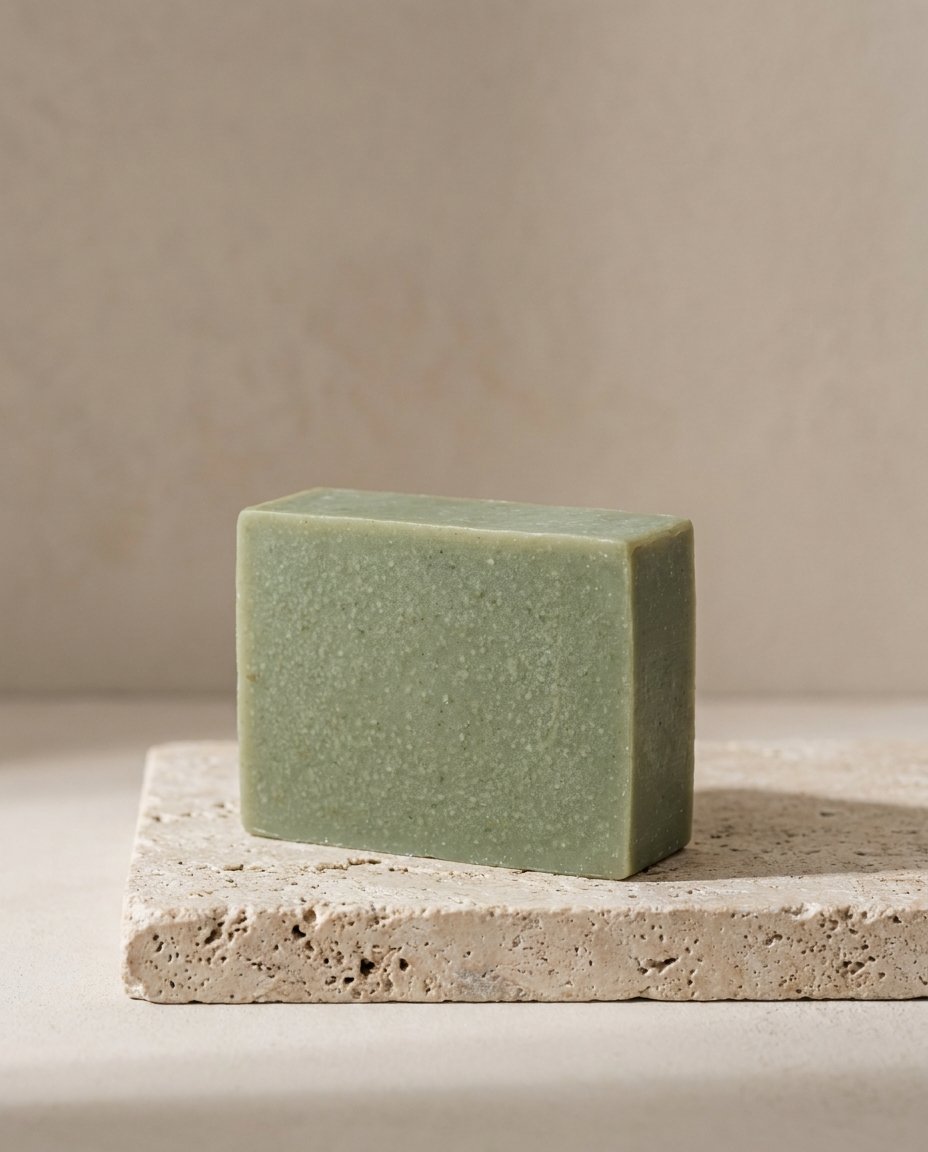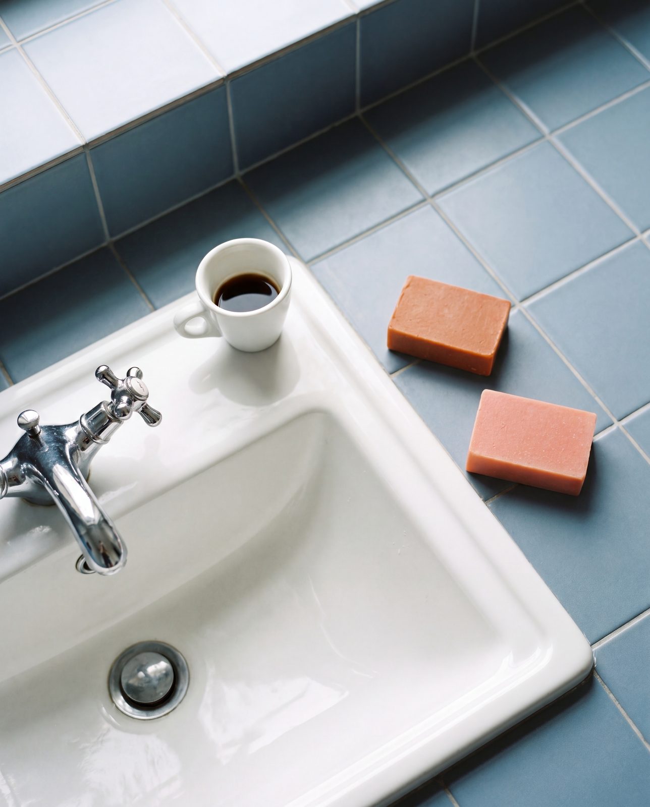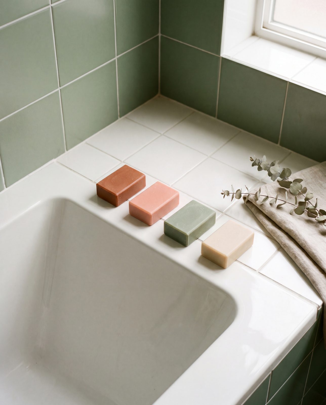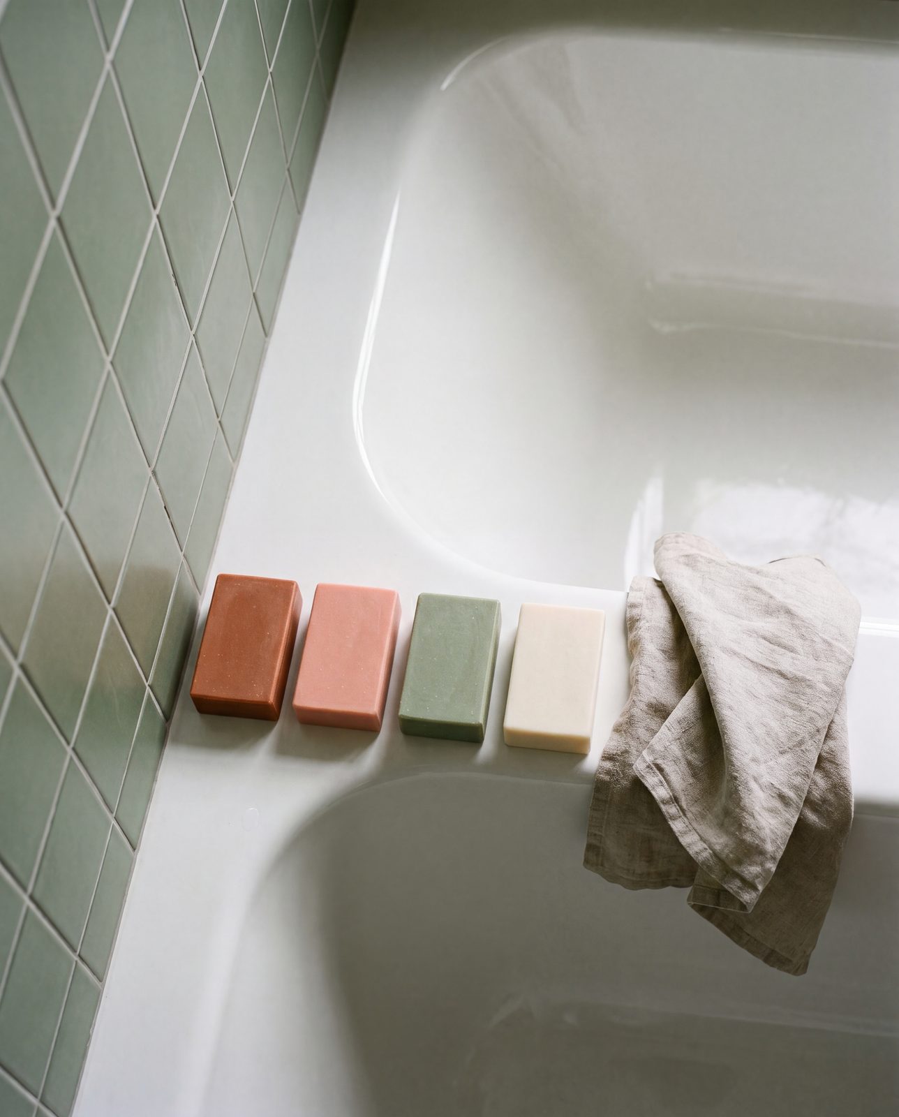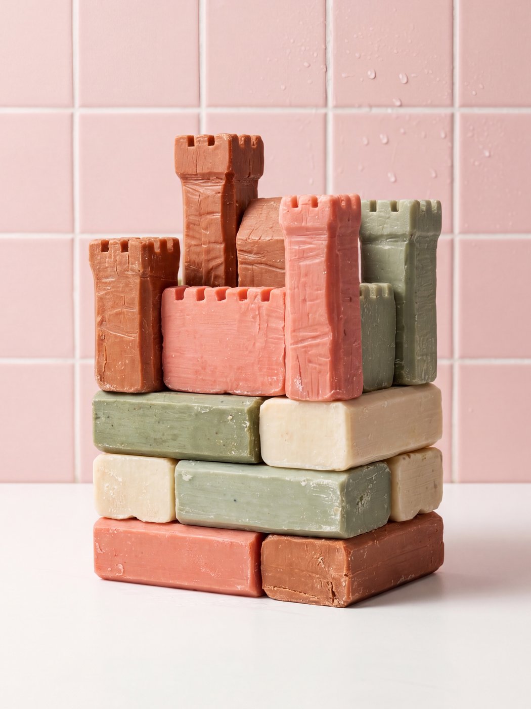
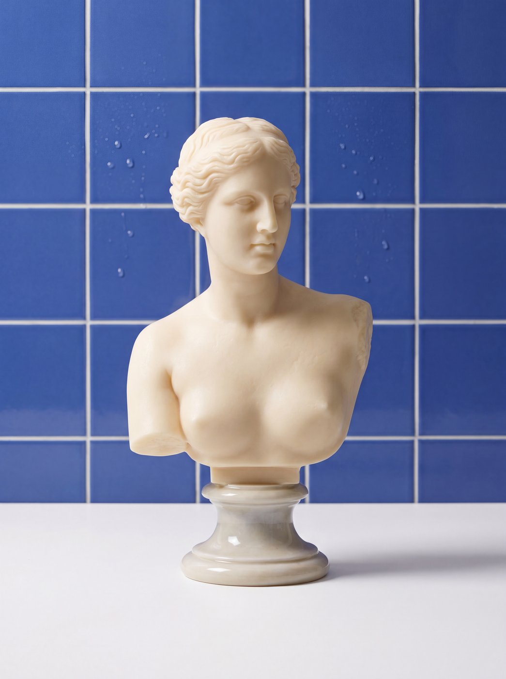
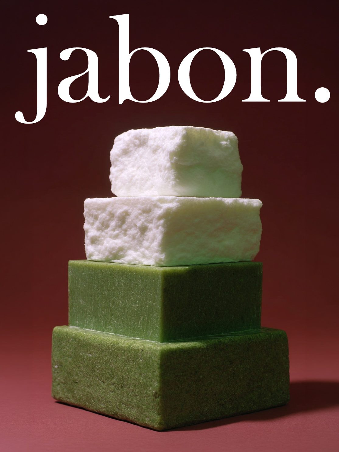
Product in motion — a study in material and color.
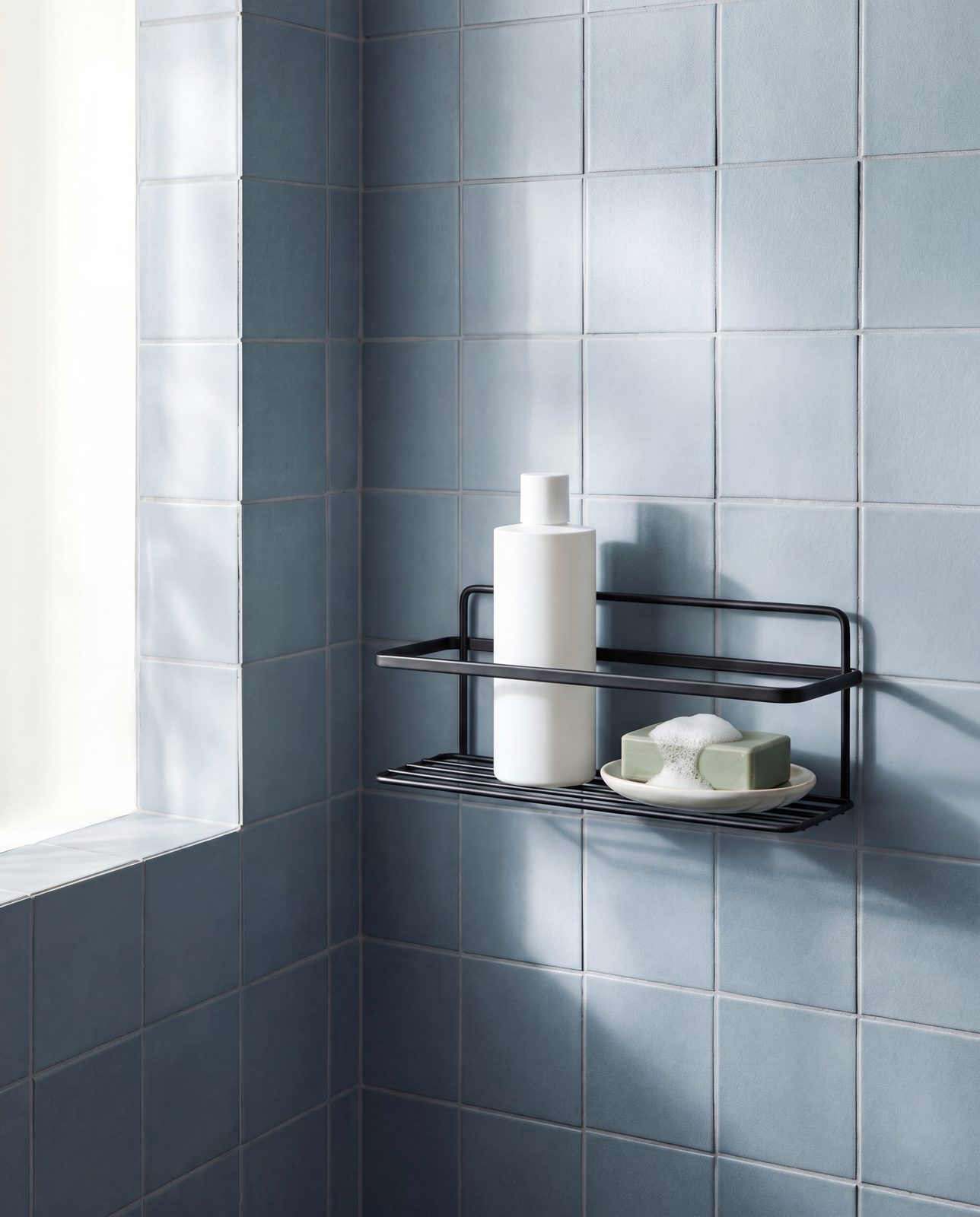
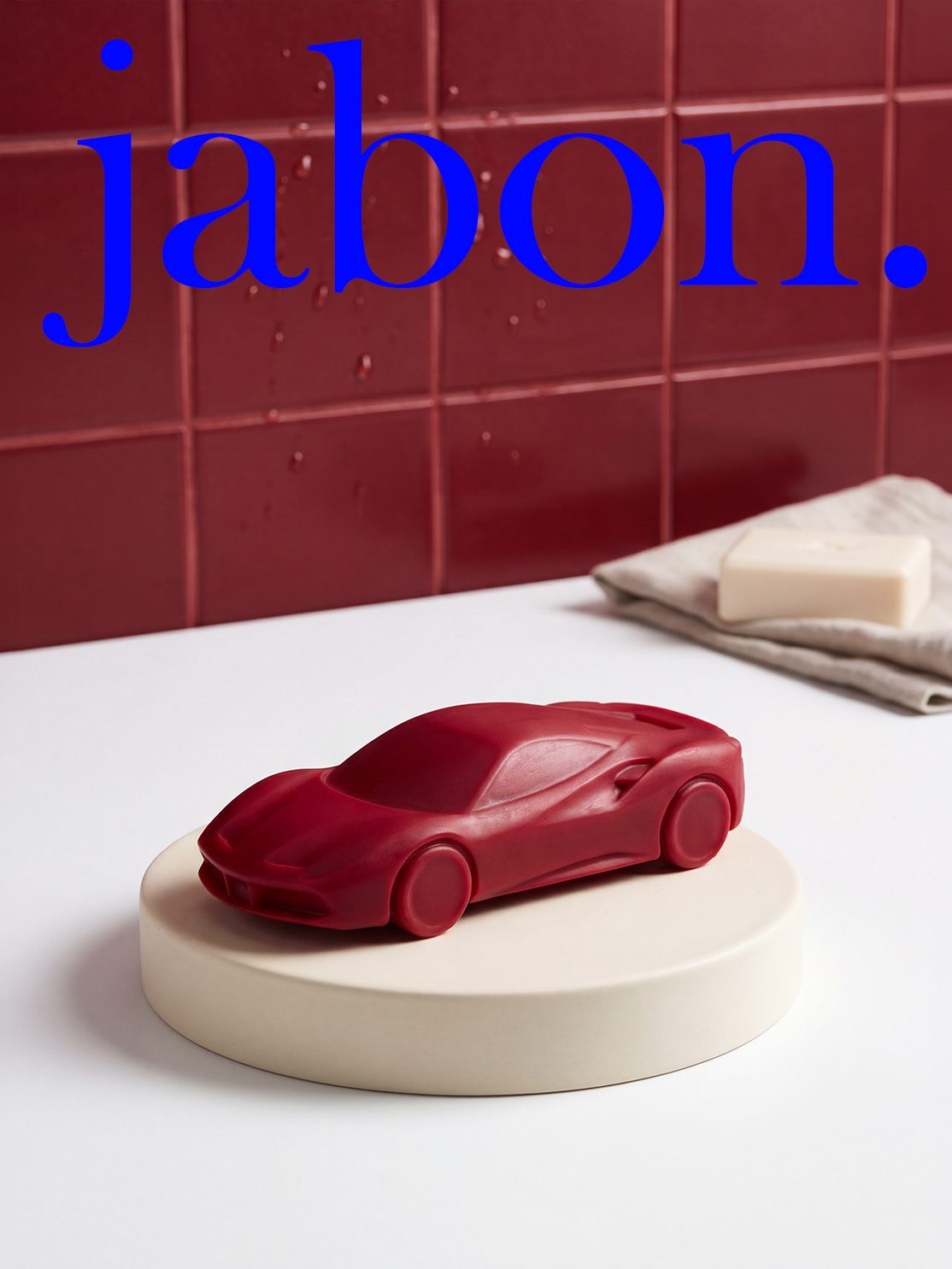
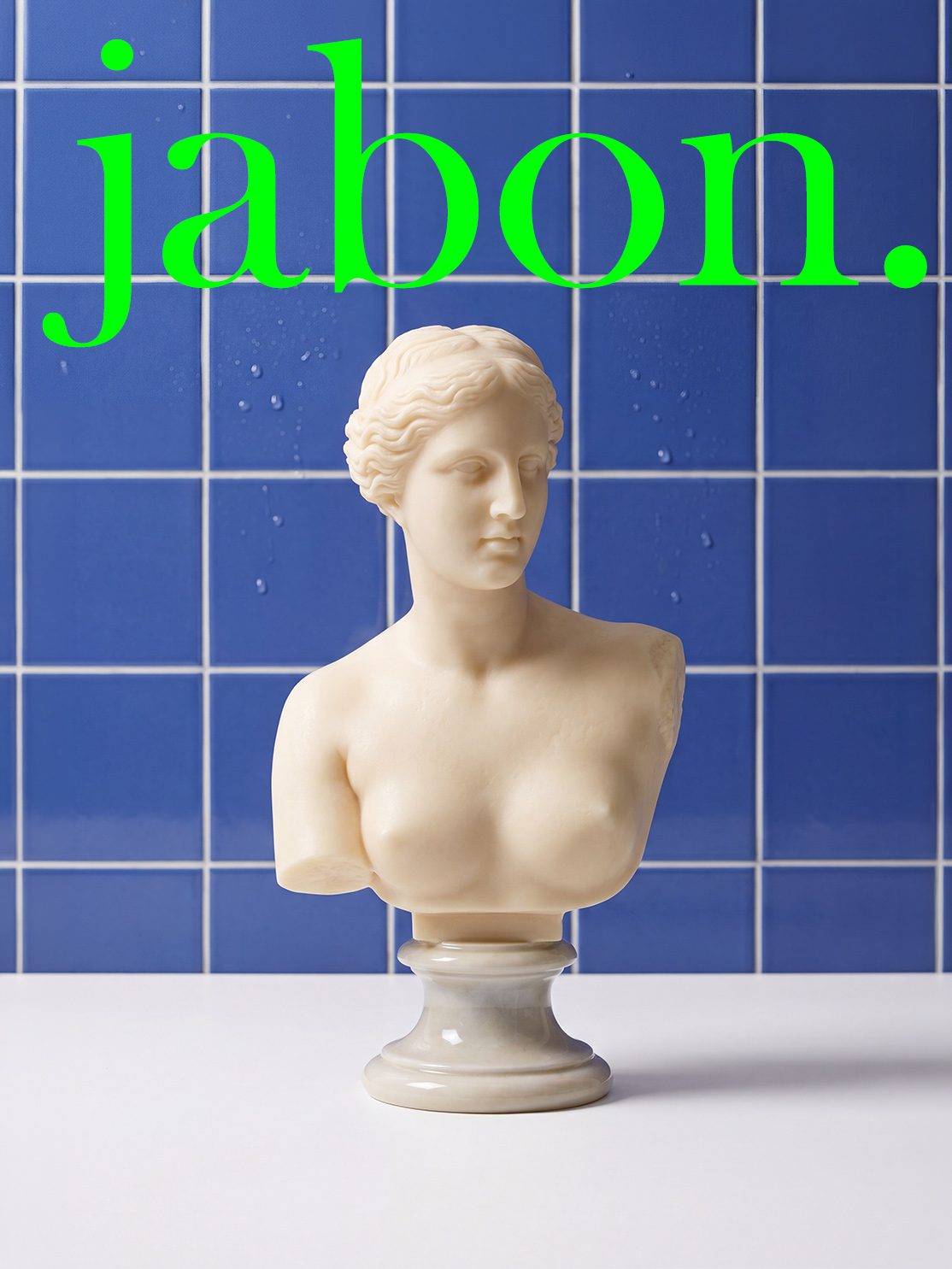
A campaign built on contrast — the everyday ritual of the bath meets the quiet color of the tile. Two scenes, one product, the same sense of stillness.
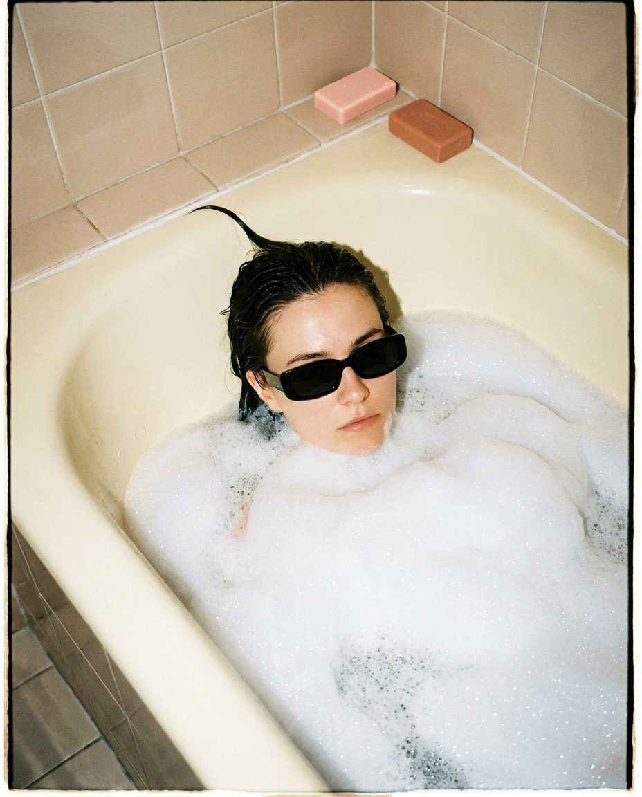
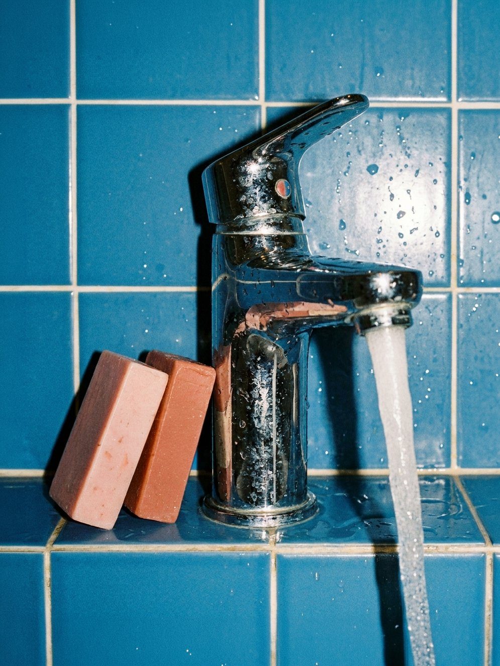
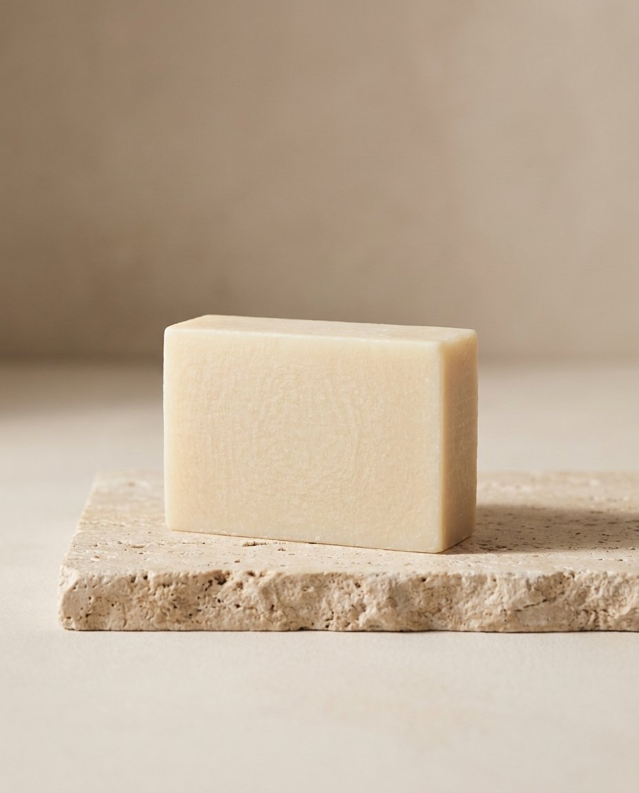
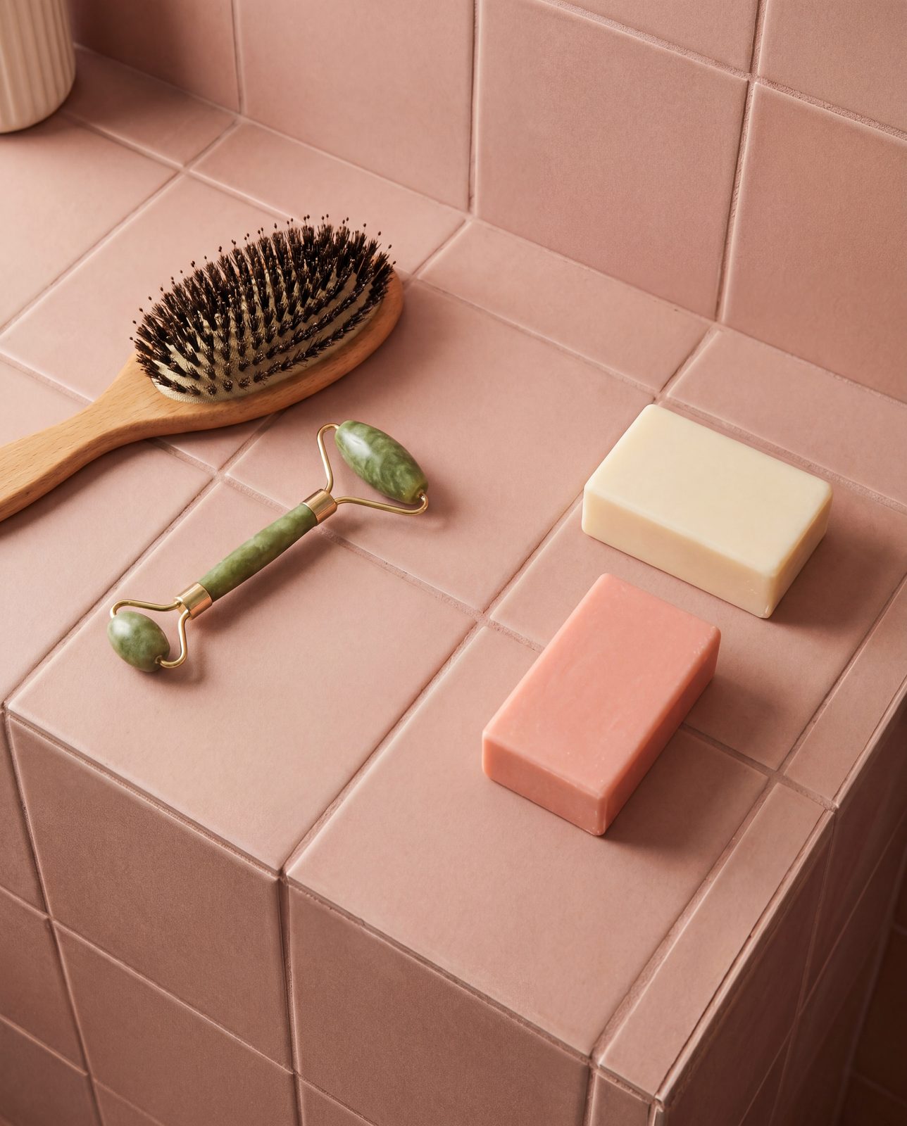
Two ways of seeing the same material. One direction is classical — soft light, muted backdrops, a sense of history. The other is pop — saturated tile, sharp color, a wink at toy-store excess. Both are jabon.
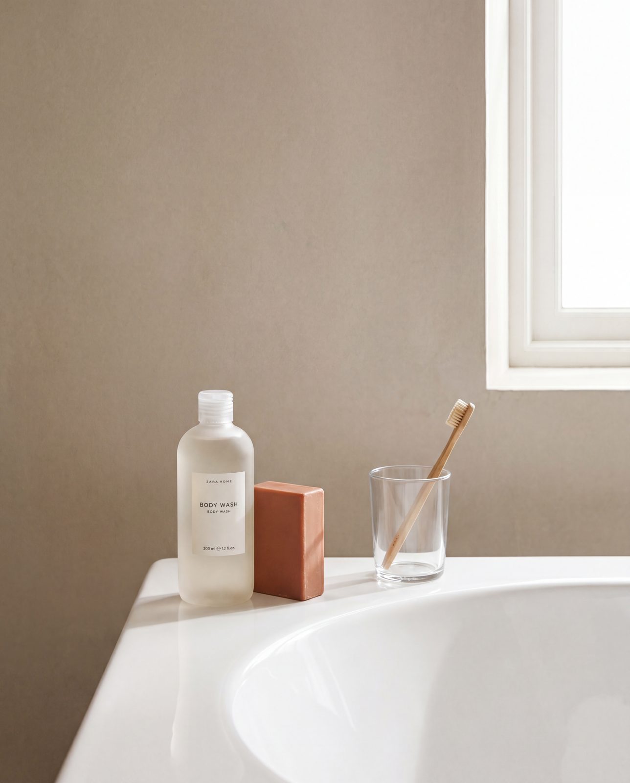
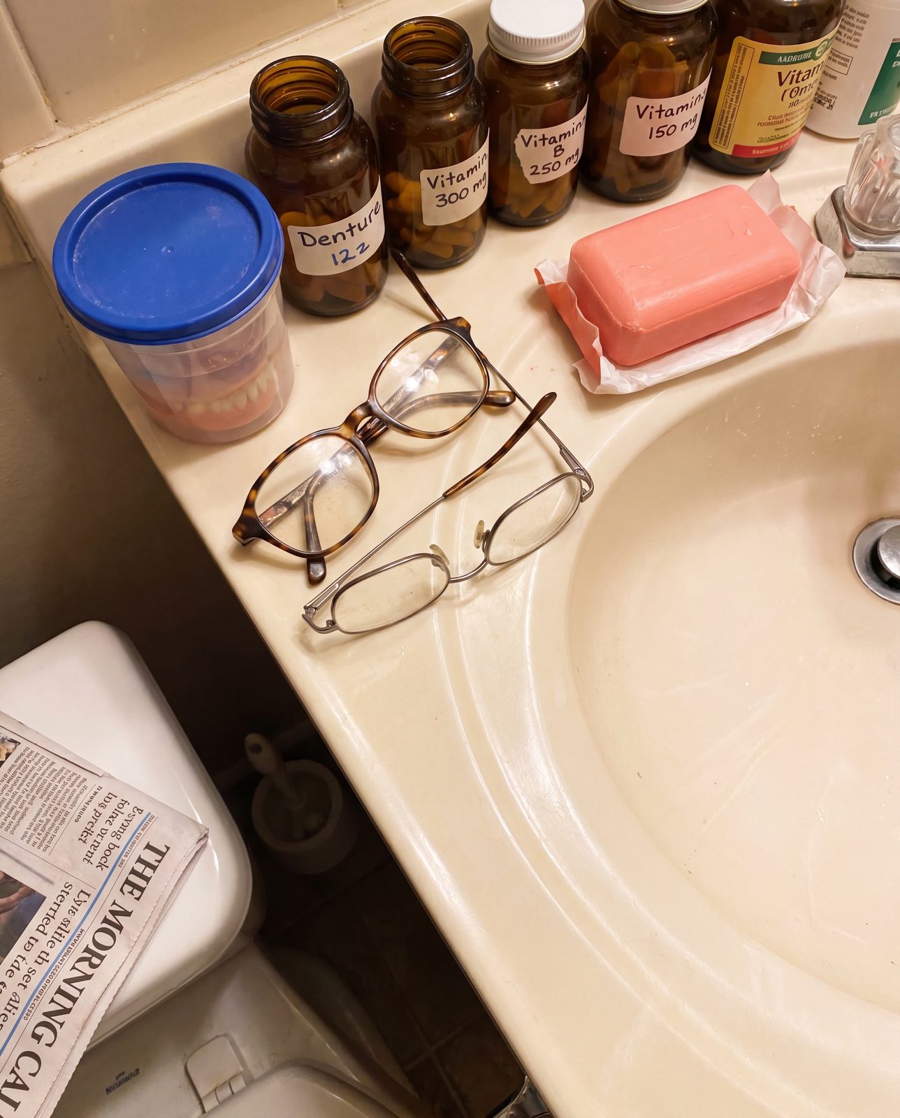
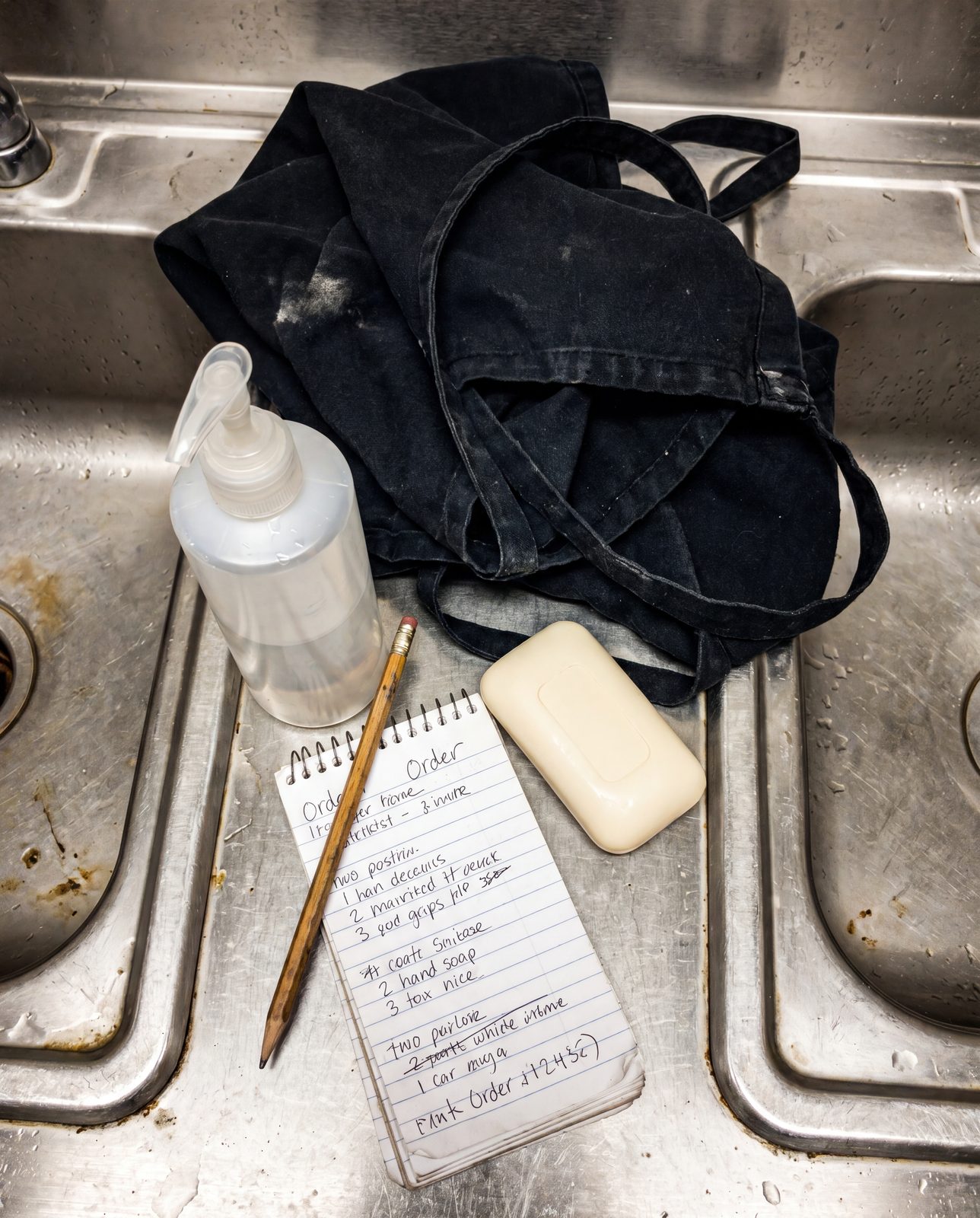
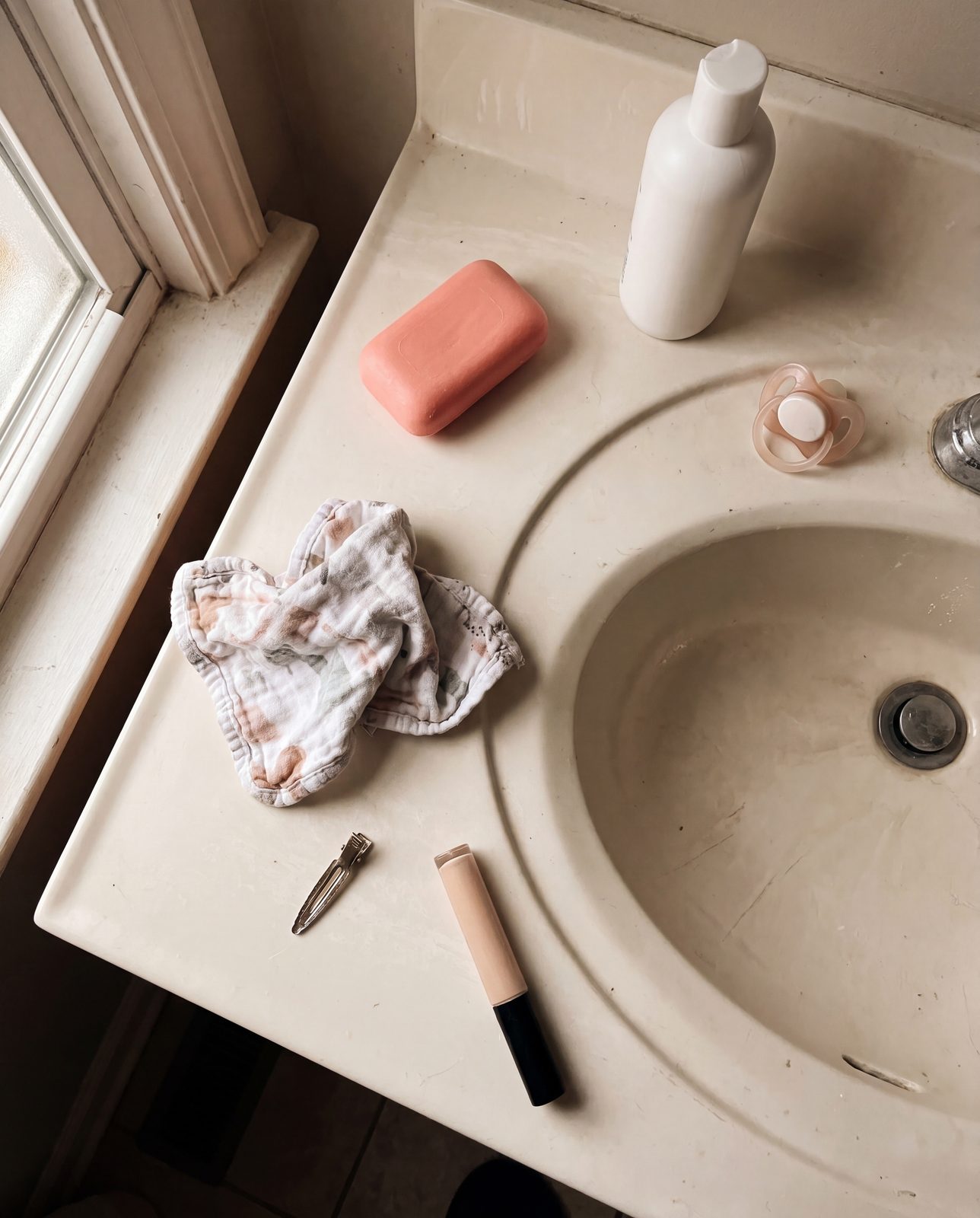
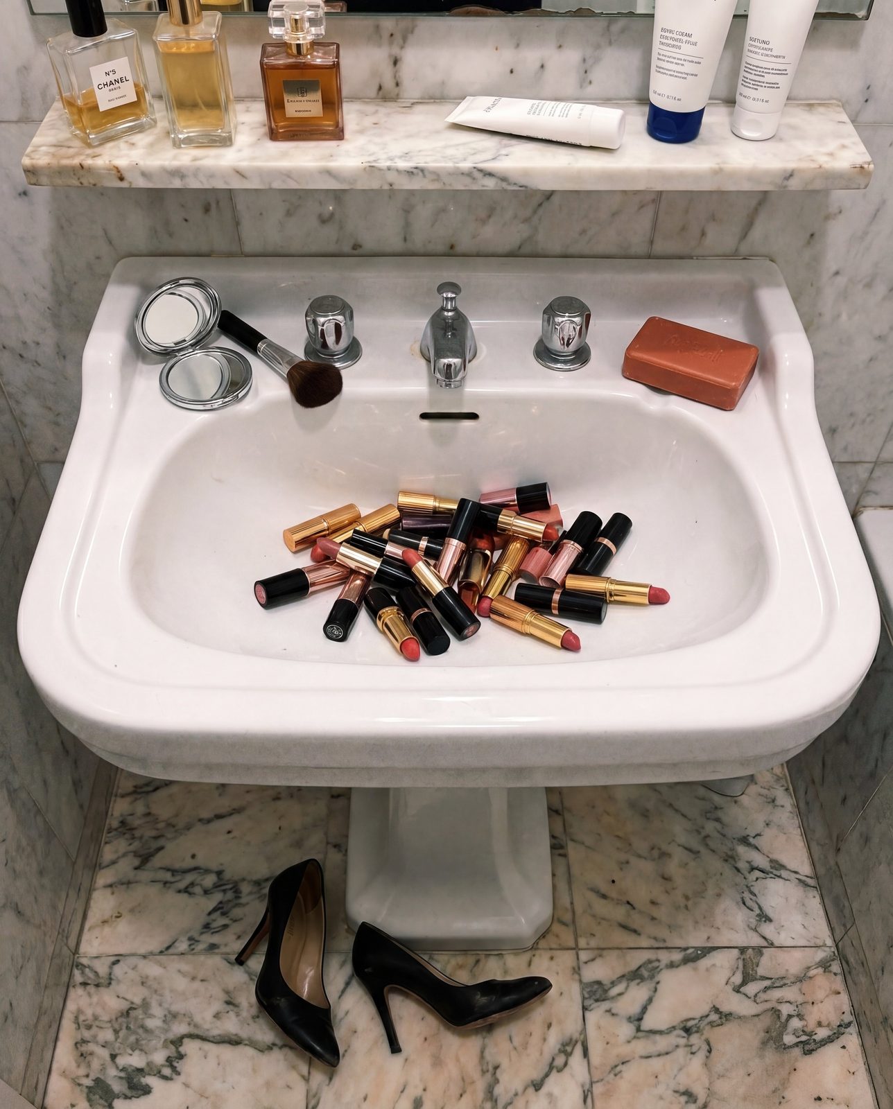
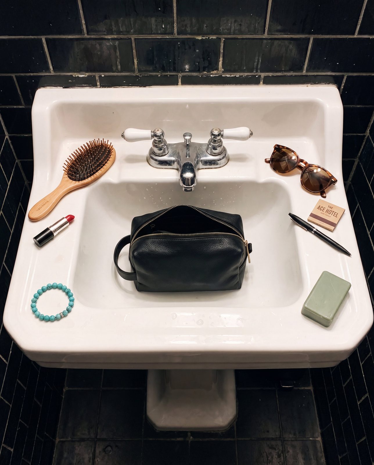
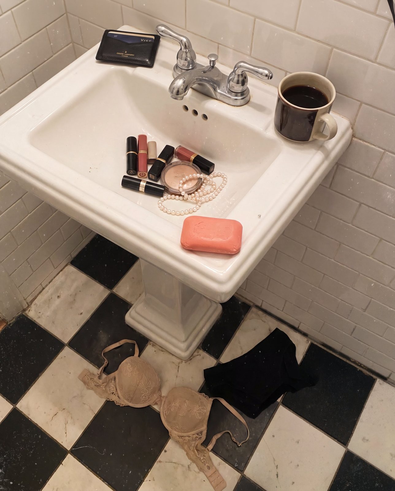
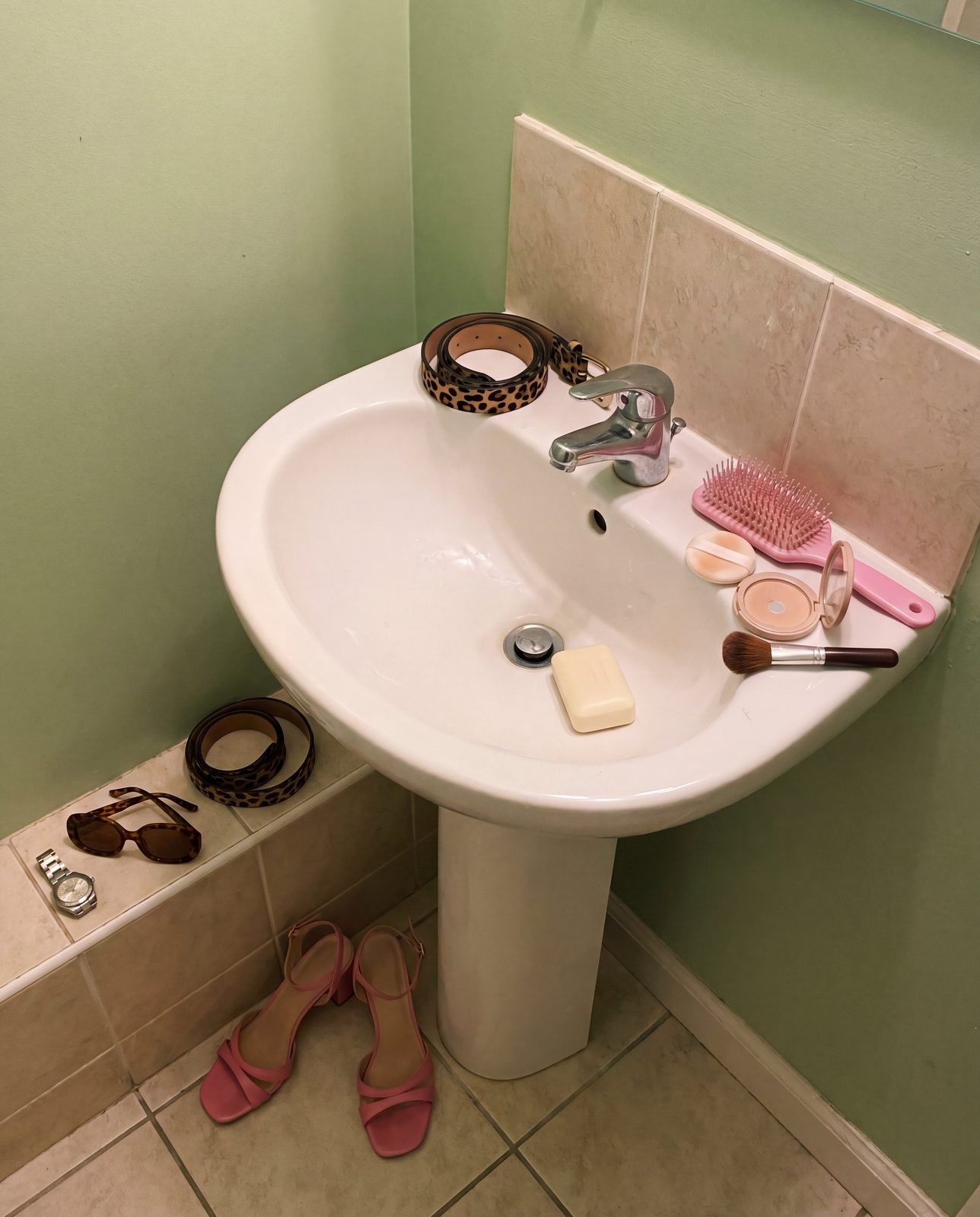
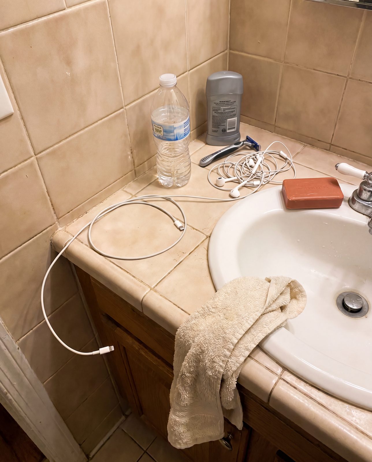
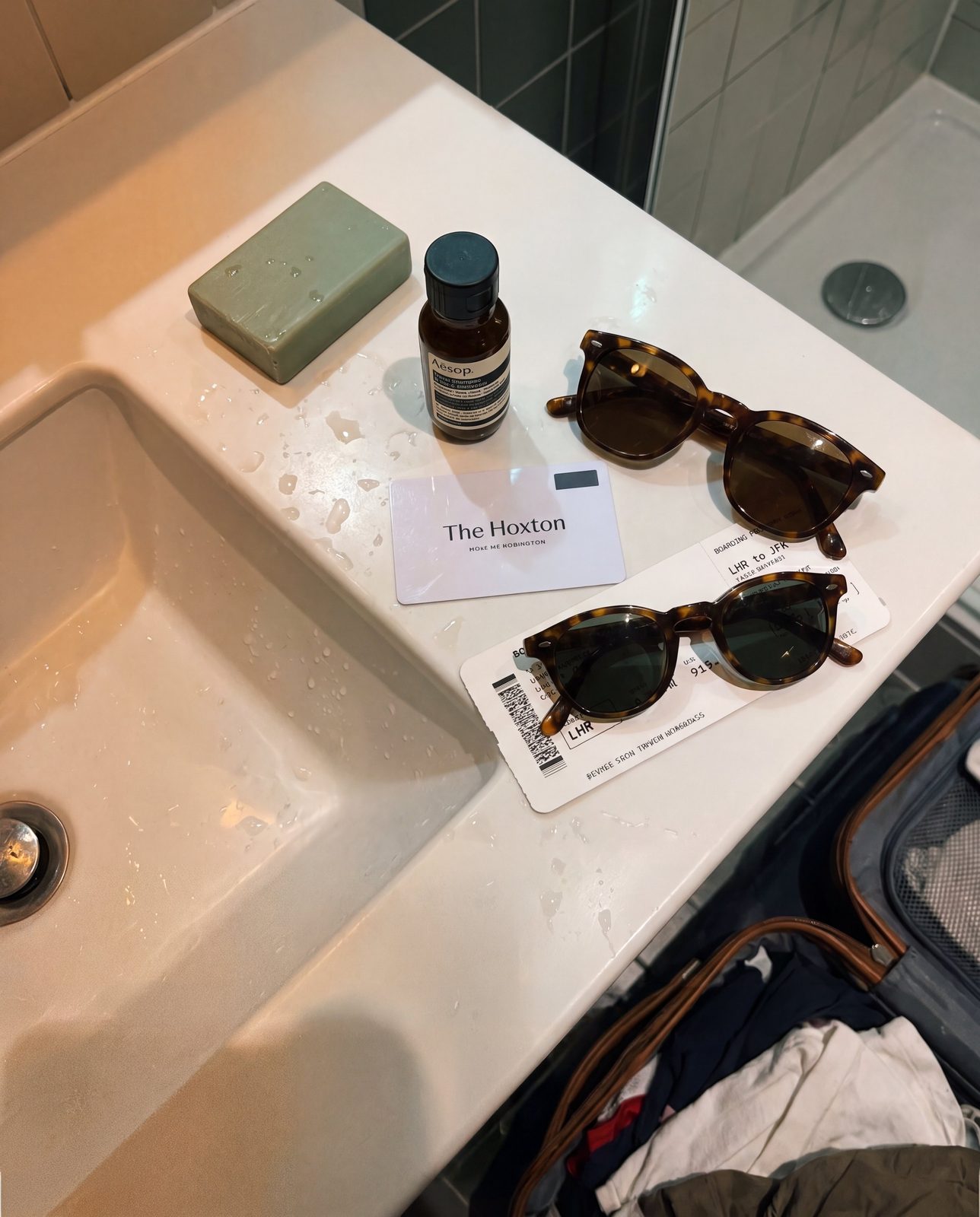
Everyone has a sink. No two are the same — each one shaped by the person who uses it, their colors, their clutter, their quiet morning routine. But on every sink, somehow, there's always soap.
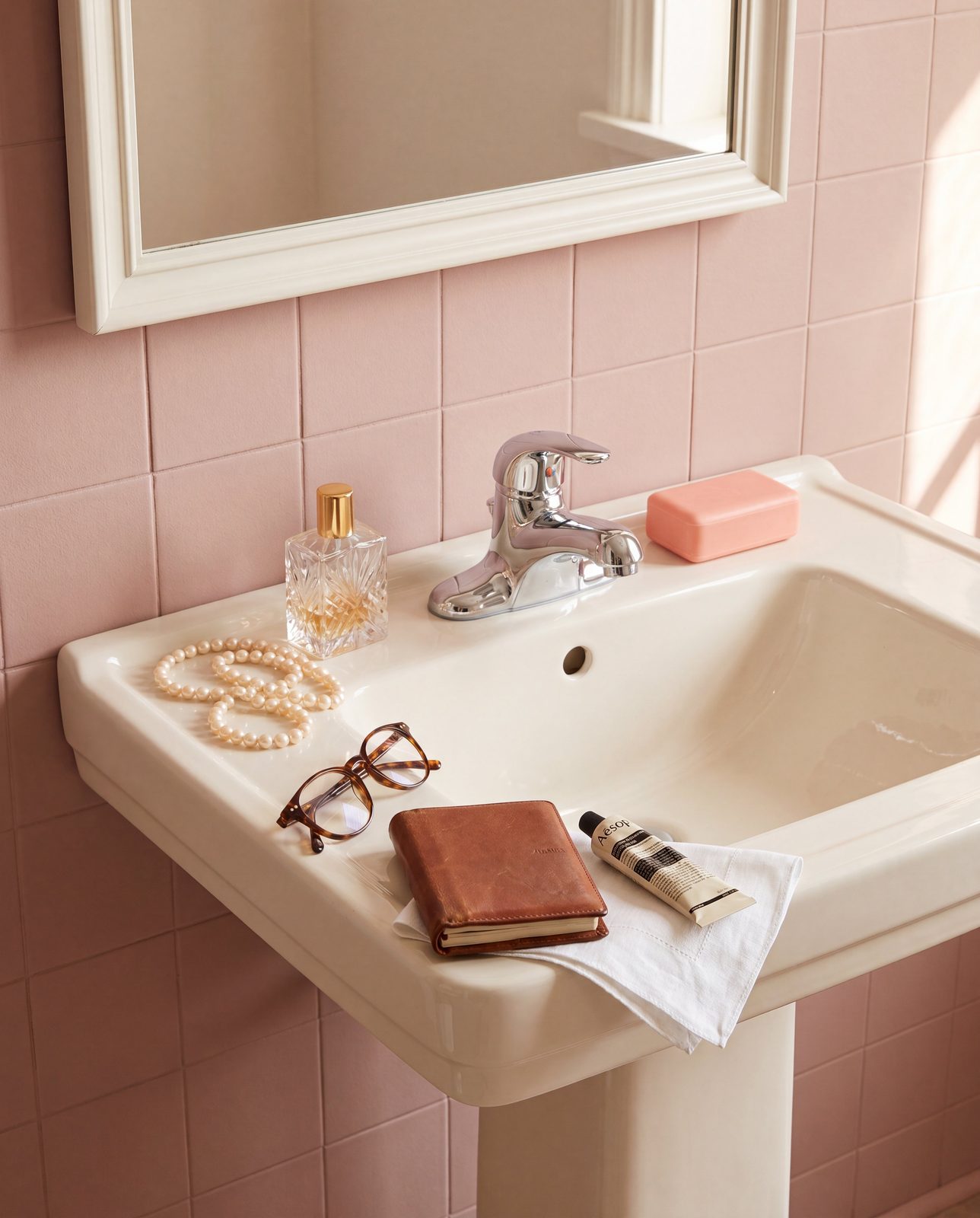
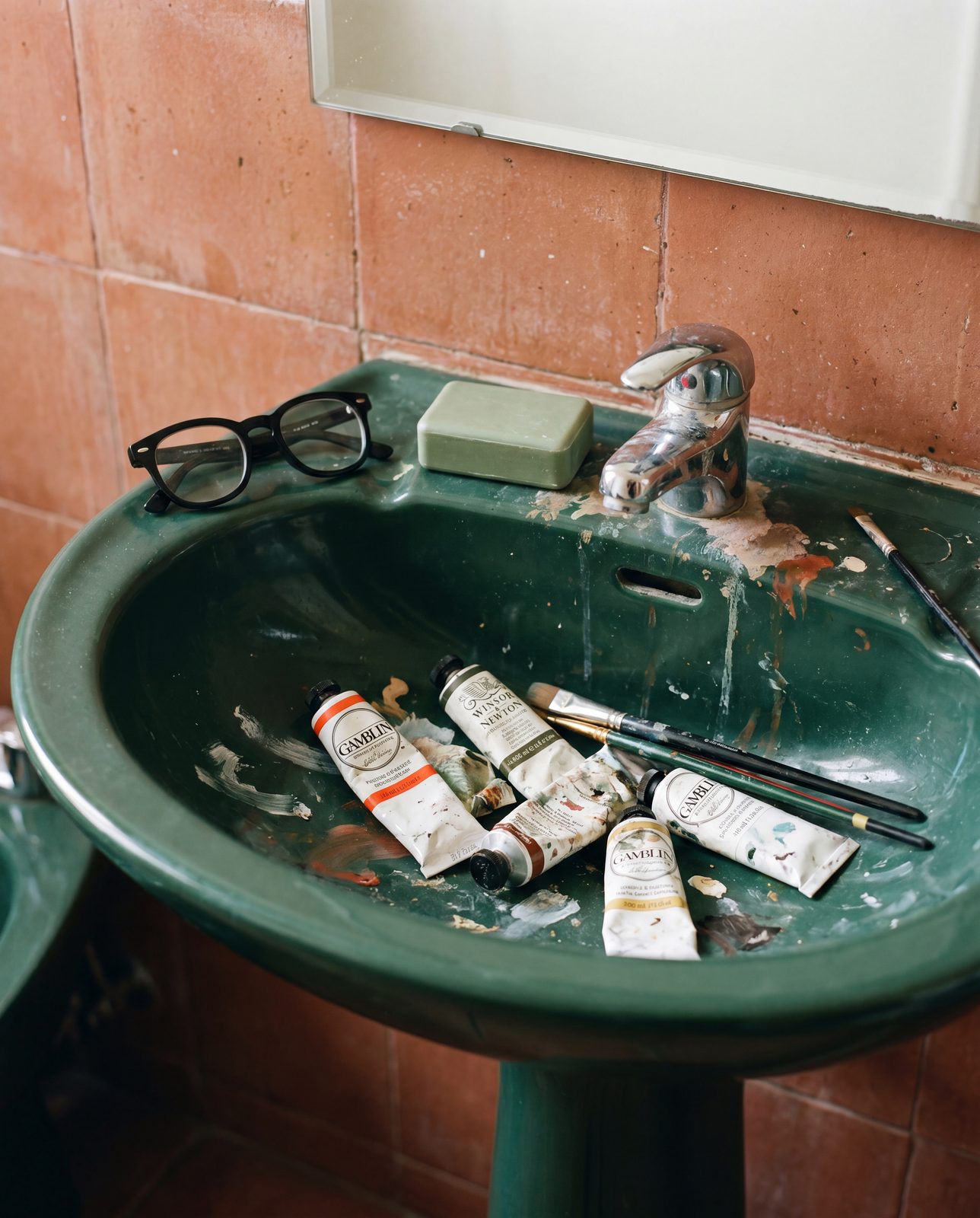
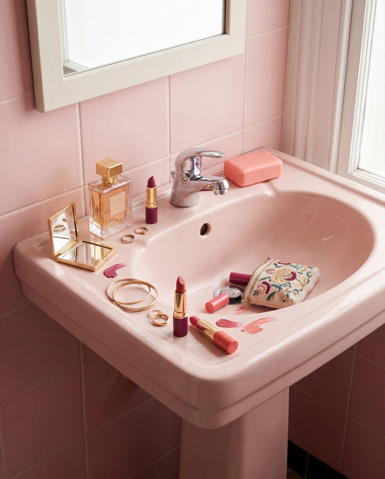
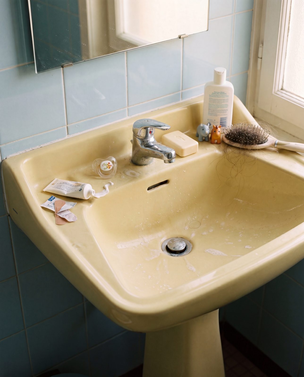
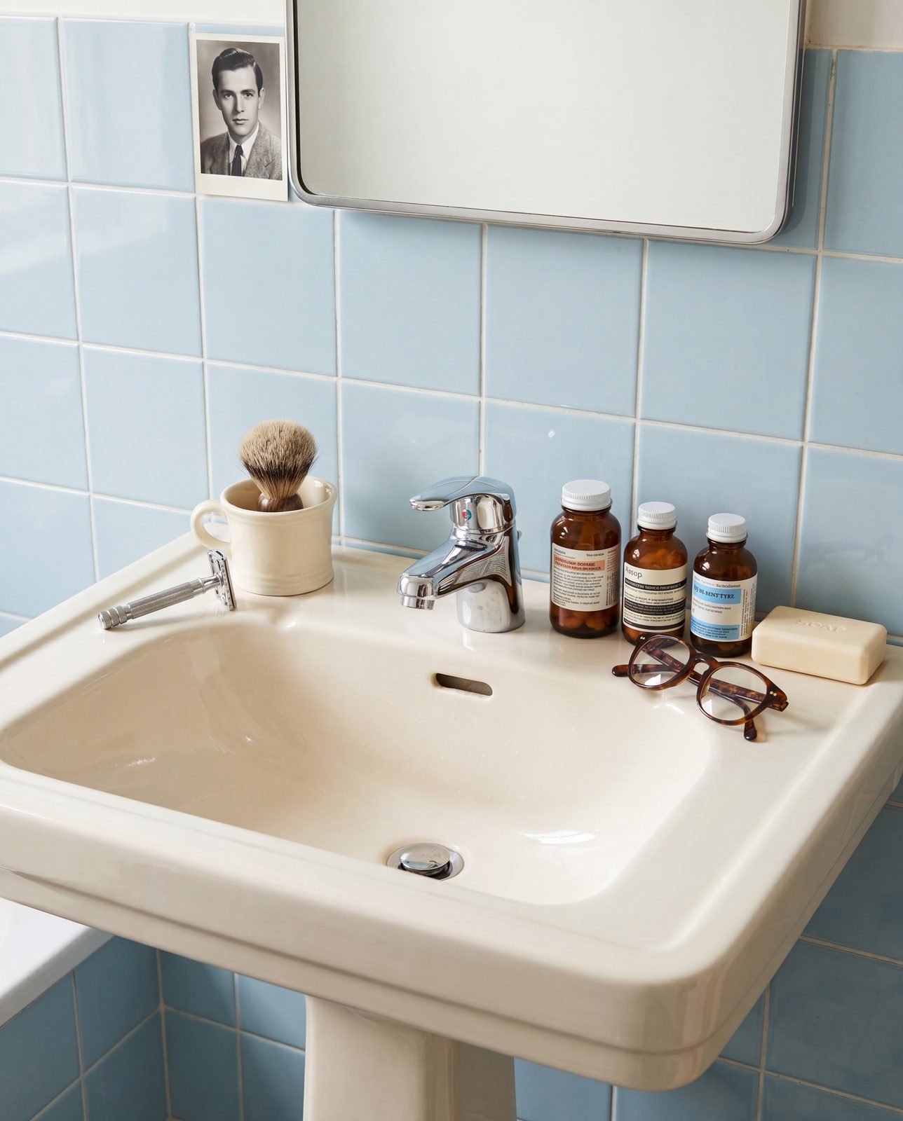
We asked people to show us their own sink. What came back wasn't curated or clean — phone photos, real bathrooms, real mess. The contrast says more about "same soap" than any campaign could.
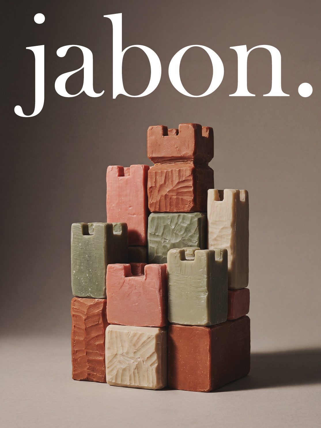
Clean product shots built for the shelf — the full range together, then each color on its own, ready for a product page.